Before and After
This page lists UX/UI items I improved whose impact wasn't measured but did make items more readable and less error-prone.
For a list of items that had a measurable impact, see the most impactful UX/UI items I solved page.
Couchbase
Reserved words table
| Before | After |
|---|---|
| Couchbase's reserved words were listed horizontally. | I moved the words to be listed vertically with space between initial letters. |
 |  |
Color-coded system table
| Before | After |
|---|---|
| PROBLEM: Couchbase's website contained a description of the system tables in a way that wasn't easy to read nor scan. | MY SOLUTION: I converted their original layout to a color-coded table while keeping the same text. |
 |  |
MNQ settings
| Before | After |
|---|---|
| PROBLEM: The original text on Couchbase's website was a hard-to-read wall of text. | MY SOLUTION: I moved the text into a table. |
 |  |
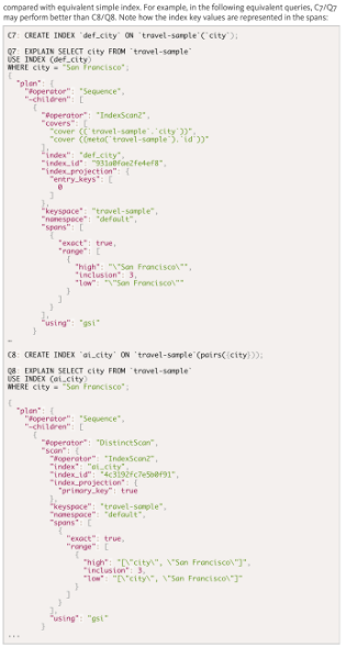
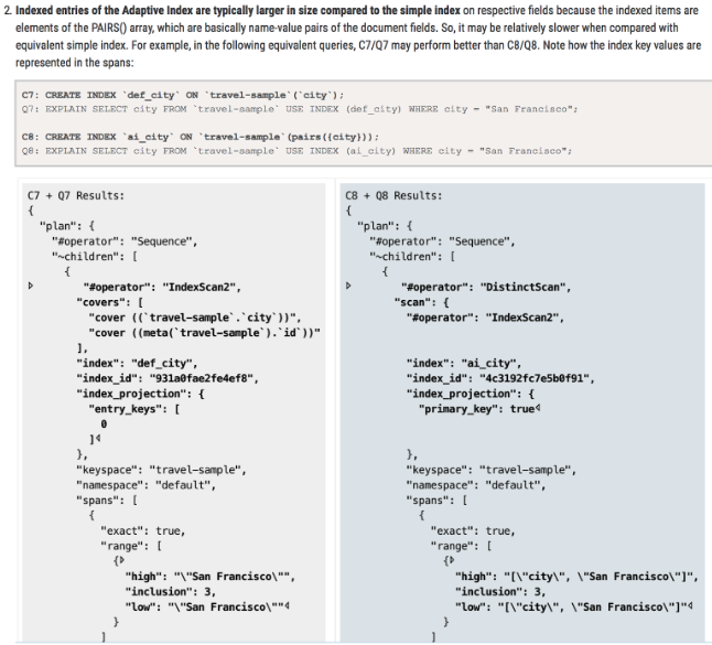
A tale of two code blocks
| Before | After |
|---|---|
| PROBLEM: The original text on Couchbase's site required a lot of scrolling up and down to compare the two code versions, and the changes weren't evident. | MY SOLUTION: I placed the code blocks side by side and bolded the changed lines. |
 |  |
Interview challenge
| Before | After |
|---|---|
| During my Couchbase interview, my interviewer gave me 30 minutes to improve a website's page to be more readable and easier to understand. | I replaced the original wall of text with a graph and tables that show the concepts more clearly. |
 |  |
Apple
Apple's developer guides for the robots assembling iPads (left side) needed clarification and elaboration (right side) for their assembly line in China.
User guide CAM header
| Before | After |
|---|---|
| PROBLEM: The previous writer numbered the items, even though they weren't steps. | MY SOLUTION: I moved the text into five columns to be near the five sections they were describing. |
 |  |
Quickstart CAM
| Before | After |
|---|---|
| PROBLEM: It listed unnecessary steps while not having enough detail. | MY SOLUTION: I removed the unnecessary steps, added screenshots to clarify the descriptions, and elaborated some steps. |
 |  |
Troubleshooting robot
| Before | After |
|---|---|
| PROBLEM: The previous writer intermixed English and Chinese, which is hard to read. | MY SOLUTION: I moved the two languages into separate columns for easy scanning. |
 |  |
System admin tool set
| Before | After |
|---|---|
| PROBLEM: English and Chinese were intermixed and hard-to-read. | MY SOLUTION: I moved the two languages into separate columns for easy scanning. |
 |  |
TEDx Adventures
TEDxBeaconStreet wanted their Adventures guidebook (left side) to have a newer and refreshed look while improving their wording (right side).
Background
| Before | After |
|---|---|
| TEDxBeaconStreet wanted their Adventures guidebook to have a newer and refreshed look while improving their wording. | I summarized the text by year to show the progression. |
 |  |
Rules
| Before | After |
|---|---|
| TEDxBeaconStreet wanted their Adventures guidebook to have a newer and refreshed look while improving their wording. | Instead of numbered rules, I wanted short, easy-to-remember two-word phrases with a brief description. Adding photos felt warmer than a gray box. |
 |  |
Lifecycle
| Before | After |
|---|---|
| Some TEDxBeaconStreet pages were simply notes of ideas that they wanted conveyed. | I took those notes and wrote about them in the same style as the other Adventure guidebook pages. |
 |  |
Mica Games
25% more players and sales
Mica Games (Seattle, remote part-time) –– 25% more players and revenue from my suggested changes to his games
| Before | After |
|---|---|
| PROBLEM: Brilliant word games were largely unknown because of clumsy UX/UI: - WordZap - Cricklers | MY SOLUTION: 31 ideas to improve the UX/UI, gameplay, settings, and other aspects. |
 |  |
| RESULTS: The owner of the game said the number of players had increased by 25% due to word-of-mouth. |